
This project aims to visualize the viewing patterns on Youtube. What makes it unique is that these patterns are analyzed during a pandemic.
So what do people across the world watch during a pandemic? Are they inclined to watching news to get regular updates or are they watching stuff that brings some kind of solace during the pandemic? Or is all of this dependent on the geographical location?
To answer these questions this analysis could be quite insightful. One way for me to do this was leverage data from YouTube. I chose this medium because it has diverse content that is tailored towards the latest happenings in the world. Moreover, YouTube identifies each video into categories. The list of categories in this project is as follows:
- Entertainment
- Music
- People & Blogs
- News & Politics
- Comedy
- Howto & Style
- Science & Technology
- Sports
- Film & Animation
- Gaming
- Education
- Autos & Vehicals
- Nonprofits & Activism
- Travel & Events
- Pets & Animals
Assuming that YouTube assigns the categories to videos accurately, this provides a good start to see what ‘kind’ of videos are being watched during a pandemic.
The other tool used to implement this project is Tableau. The dashboard functionality in Tableau provides the ability to have interactive elements that help draw insights from a set of different visualizations all put together in a single dashboard.
The project can be divided into the following segments:
- Creating a dataset
- Cleaning the dataset
- Creating visualizations
- Putting it all together in a dashboard
- Drawing inferences
Creating the dataset
The dataset was created using the YouTube API by pulling the most trending videos from 18 different countries over a period of 10 days in April 2020.
The countries I decided to include in the project are:
- Australia
- Brazil
- Canada
- France
- Germany
- Hong Kong
- India
- Japan
- Mexico
- Russia
- Singapore
- South Africa
- South Korea
- Spain
- Sweden
- Thailand
- United Kingdom
- United States
The python script I used for scraping this data can be found here
Whenever the script is run, it collects the trending videos and associated metadata for each country and puts it together in a csv file.
Since the trending videos of the past cannot be accessed through this API, I had to manually run it everytime I decided to pull data. I ran the script twice each day over a period of 10 days. This gave me a dataset containing ~50k rows which was good enough for this project.
You can find the dataset I used here
Cleaning the dataset
Since I had about 20 data pulls for each country, putting it all together in one big dataframe is the logical next step.
At the end of each pull of data, I’d run the following code to compile everything together for that instance:
Following this, I had about 20 such csv files created after pulling data twice over a period of 10 days in April 2020. Creating the final dataset just involved a little bit of further preprocessing and putting all the 20 files together to create one big dataset.
Creating Visualizations
The thought process while developing the visualizations was to bring out insights from the most important features about the viewing patterns.
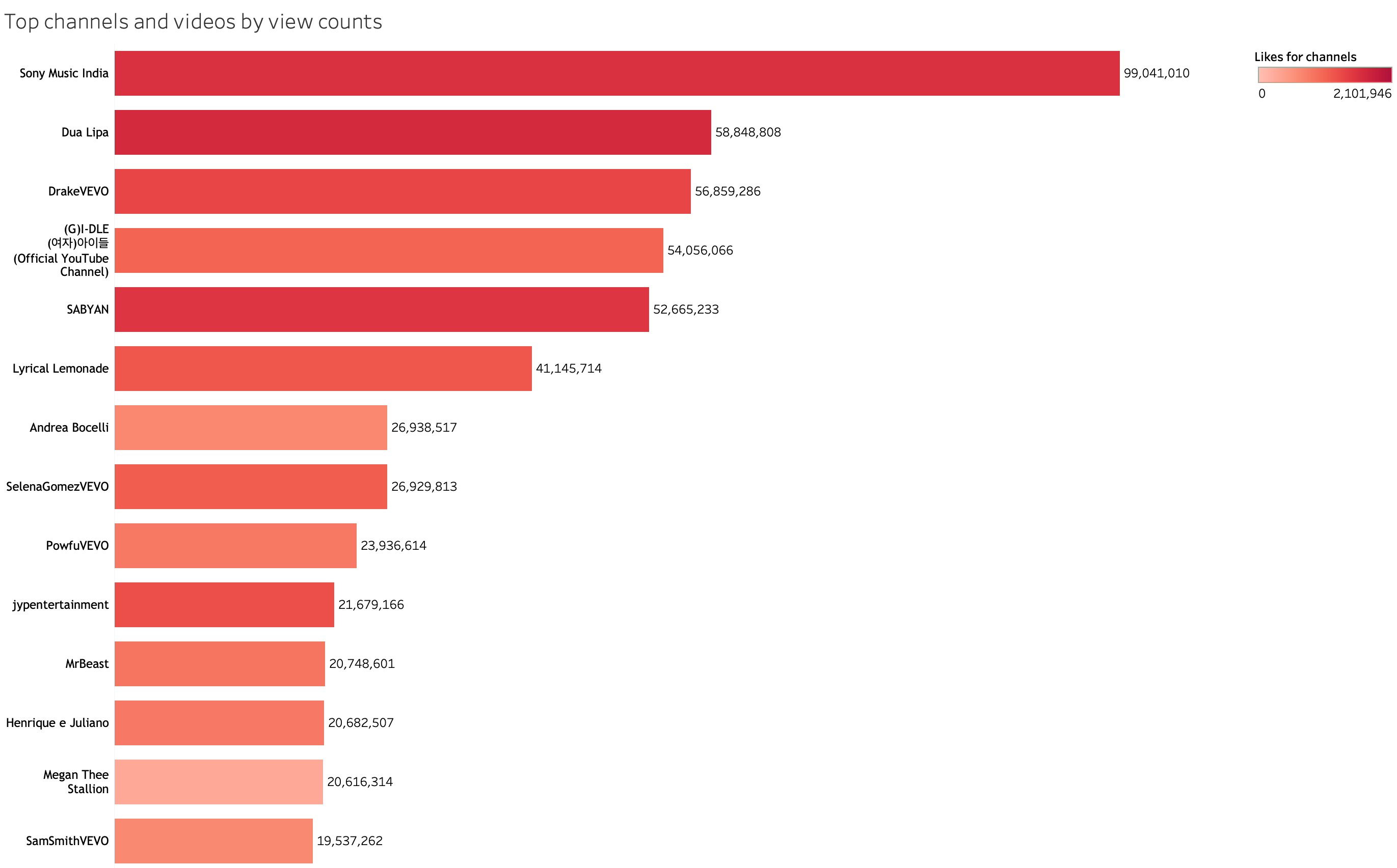
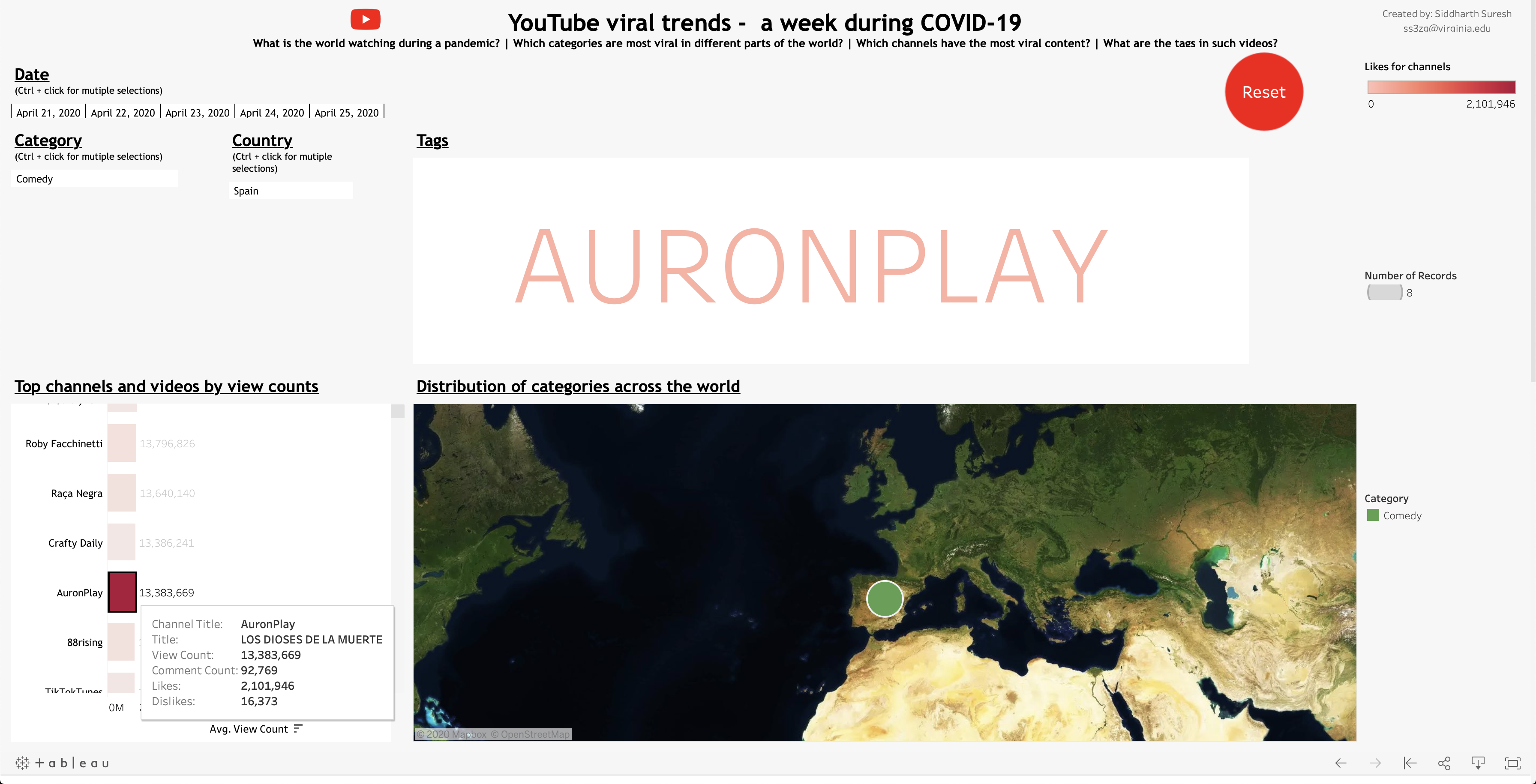
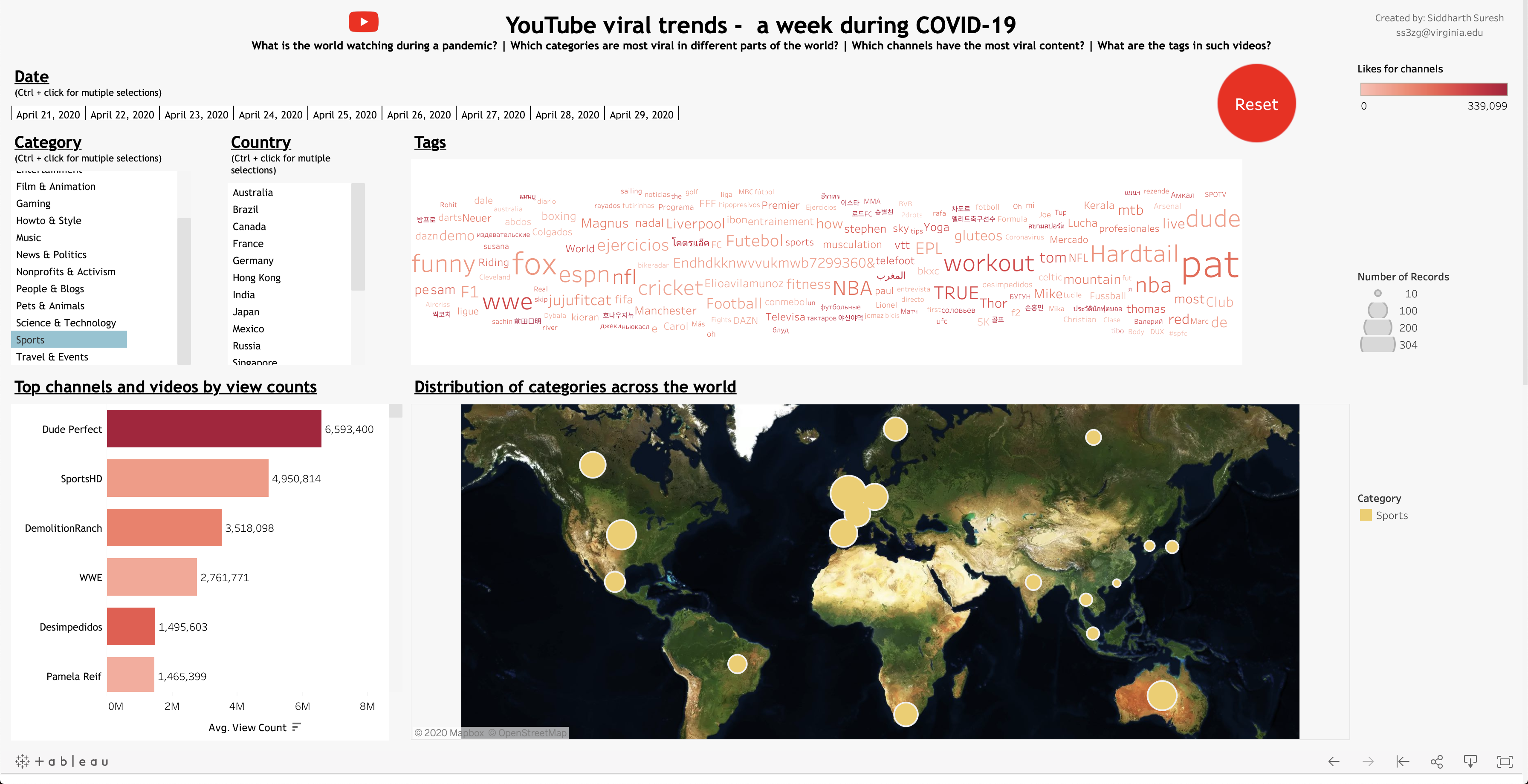
The first one was a simple horizontal bar chart that displays the top channels in the dataset based on the average view count. It was further enhanced by using a color gradient depicting the ‘likes’ on the videos produced by the channels.
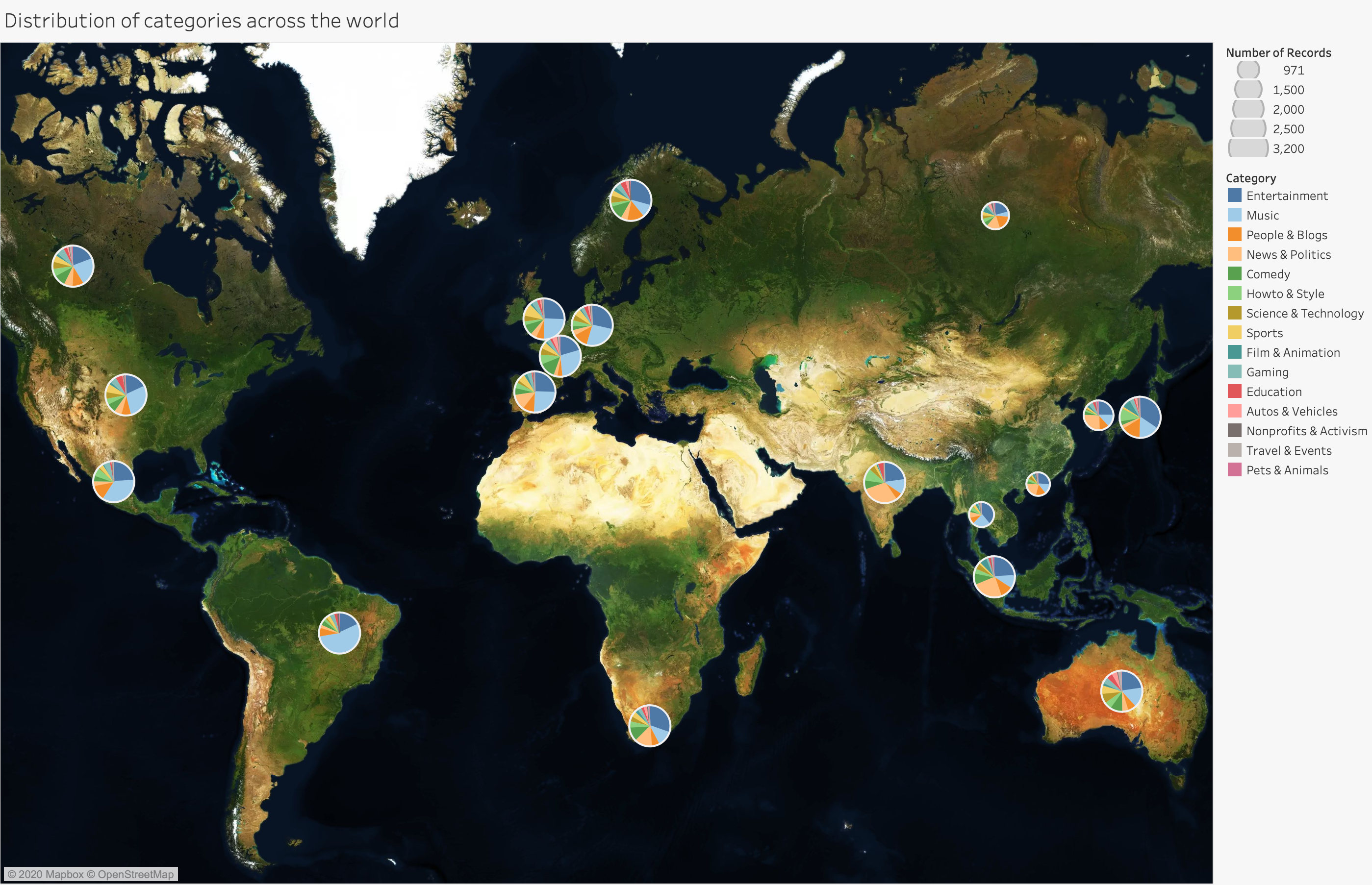
The second one was a world map based visualization that depicts the distribution of different categories of videos being watched in each country through a pie chart. This was further enhanced by designing the size of each pie chart to depict the number of trending videos from a country. The bigger the pie chart, the more trending videos originate from that country.
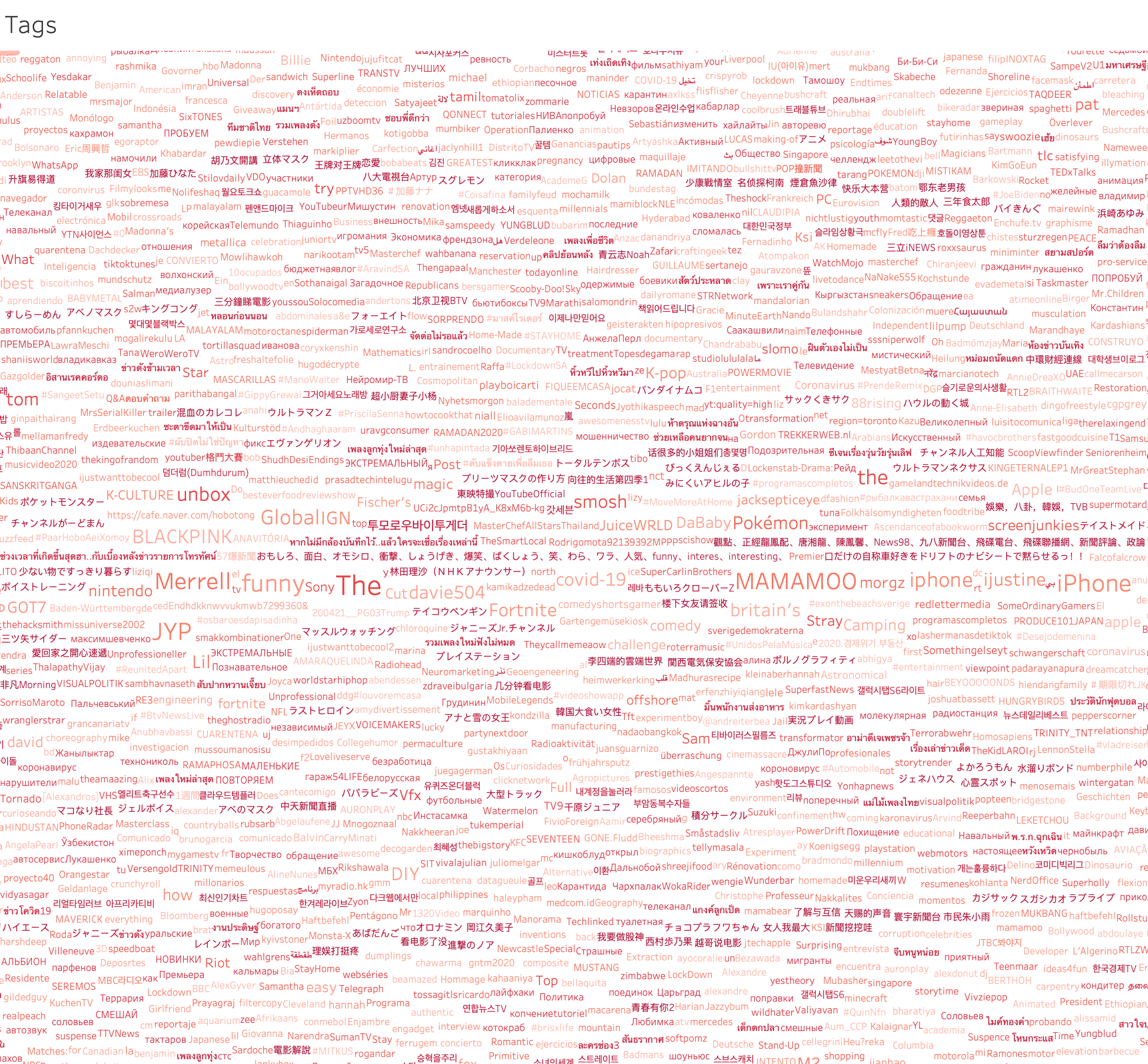
The third one was a word cloud created using the tags in the videos (precisely the 1st tag in the videos). The count of the tags was coded into the size of the word in the word cloud so that the dominant and most prevelant tags could be viewed for the viewer to get a sense of the content.
All three visualizations need to be viewed in tandem in order to compare/contrast between different countries, categories, dates, channels etc. For that, the next step is to put all this together in a dashboard.
Tableau Dashboard
Putting all these vizualizations together in Tableau is fairly easy, but to make it interactive there are other components that need to be included.
One of those things is an list based option for countries, categories, dates which should trigger upon a click and all other charts should update based on the selection. This is achieved by creating a list of the field required to act as a filter, positioning them on the dashboard alongside the vizualizations and finally selecting the option ‘Use as filter’ for each of those fields.
In addition to that there needs to exist a button that resets the dashboard to the initial state upon a click. This works in the same way as the other list options but filters to select everything in the data (or basically removes all existing filters). This can be created on a manually created button shaped object which I find neat.
The final result looks something like:
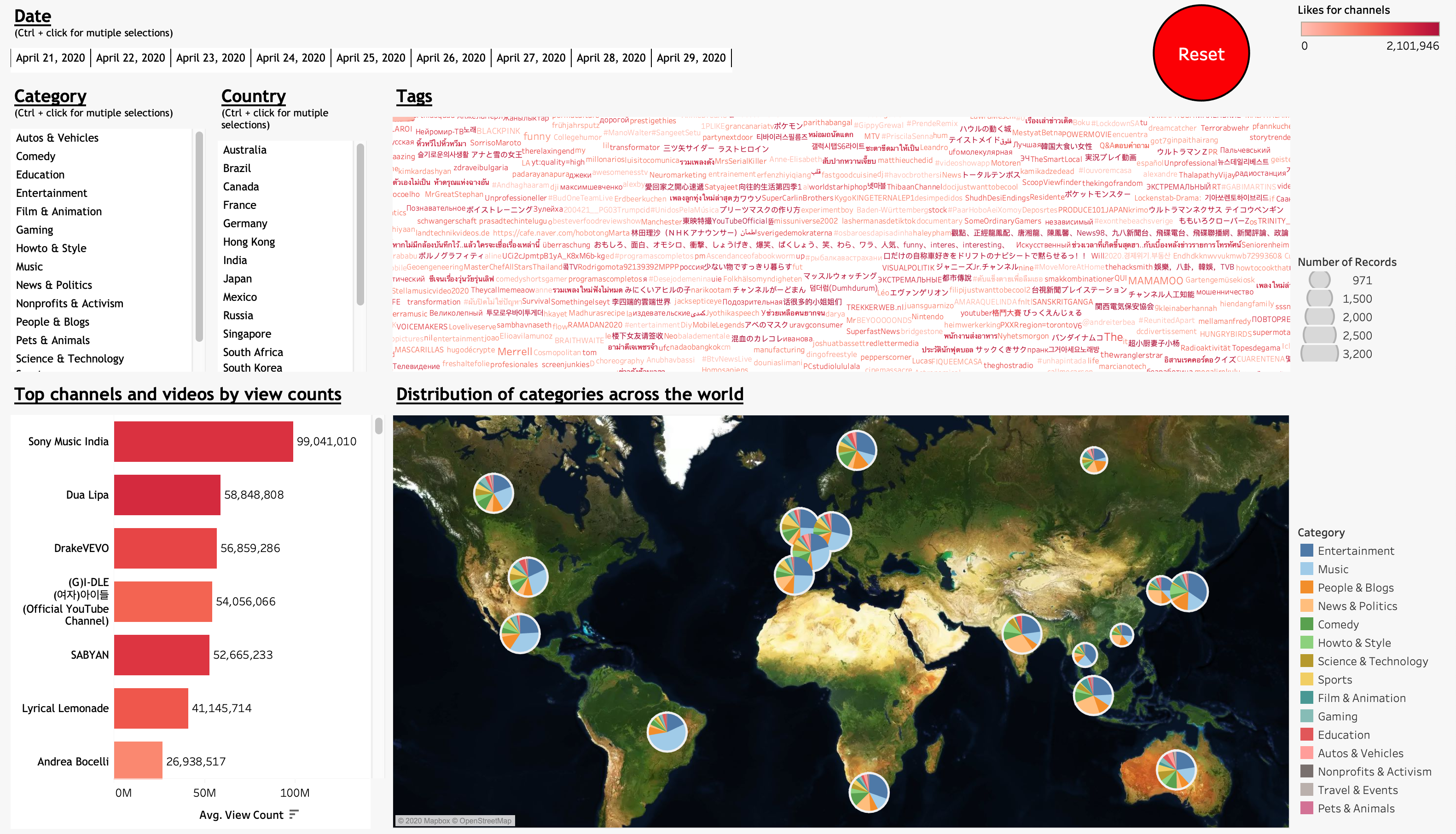
The visualization also has a tooltip feature that gives additional information about the feature when hovered over it using the mouse pointer.
Drawing inferences
Drawing inferences from such a vizualization is generally easy, which is only made tougher because of the number of permutations and combinations of selections that could be made to infer deeper trends.
The following could be individually analyzed:
- 9 different dates starting April 21, 2020
- 15 different video categories
- 18 different countries
These in themselves make up 2,430 unique selections without even considering the possibility of making multiple selections within each of these option fields. Not to mention the 100s of different channels that come up for each selection. So it’s only the viewer who can decide whether or not to limit themselves. There is lot of information within just these 50k observations that can convey a lot.
Some inferences I found interesting are:
- News & Politics is being watched in the east while Entertainment & Music is being watched in the west
USA, Canada & Mexico
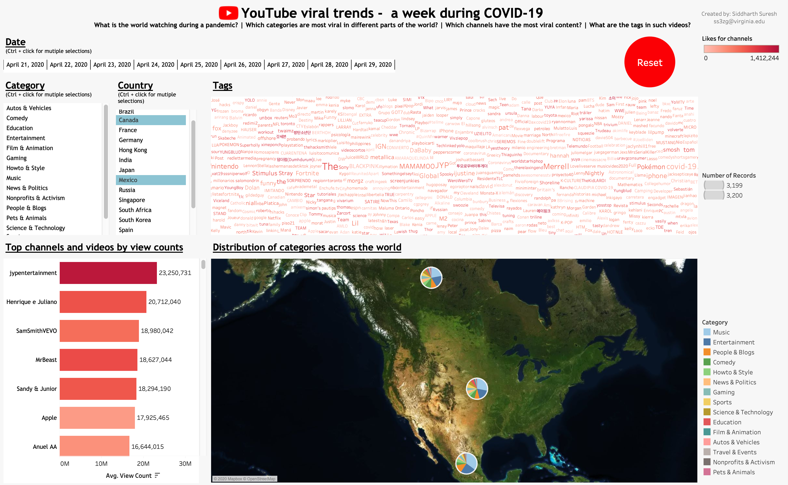
India, Hong Kong, South Korea & Singapore
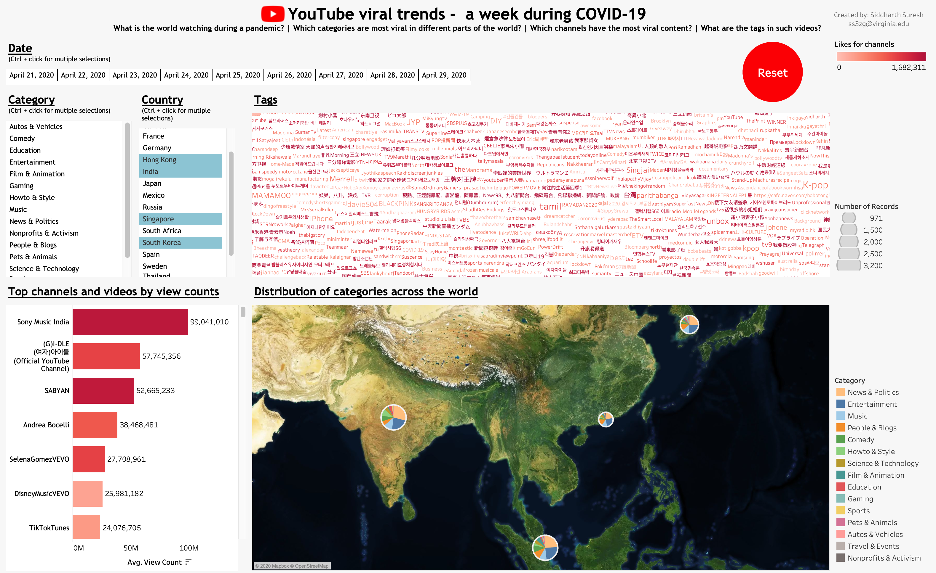
Seems like the western countries need entertainment and music more during a pandemic while the eastern countries view news and politics related videos.
-
Music channels are the most viewed channels overall
-
Amongst ‘comedy’ & ‘people & blogs’ Europe seems to be split
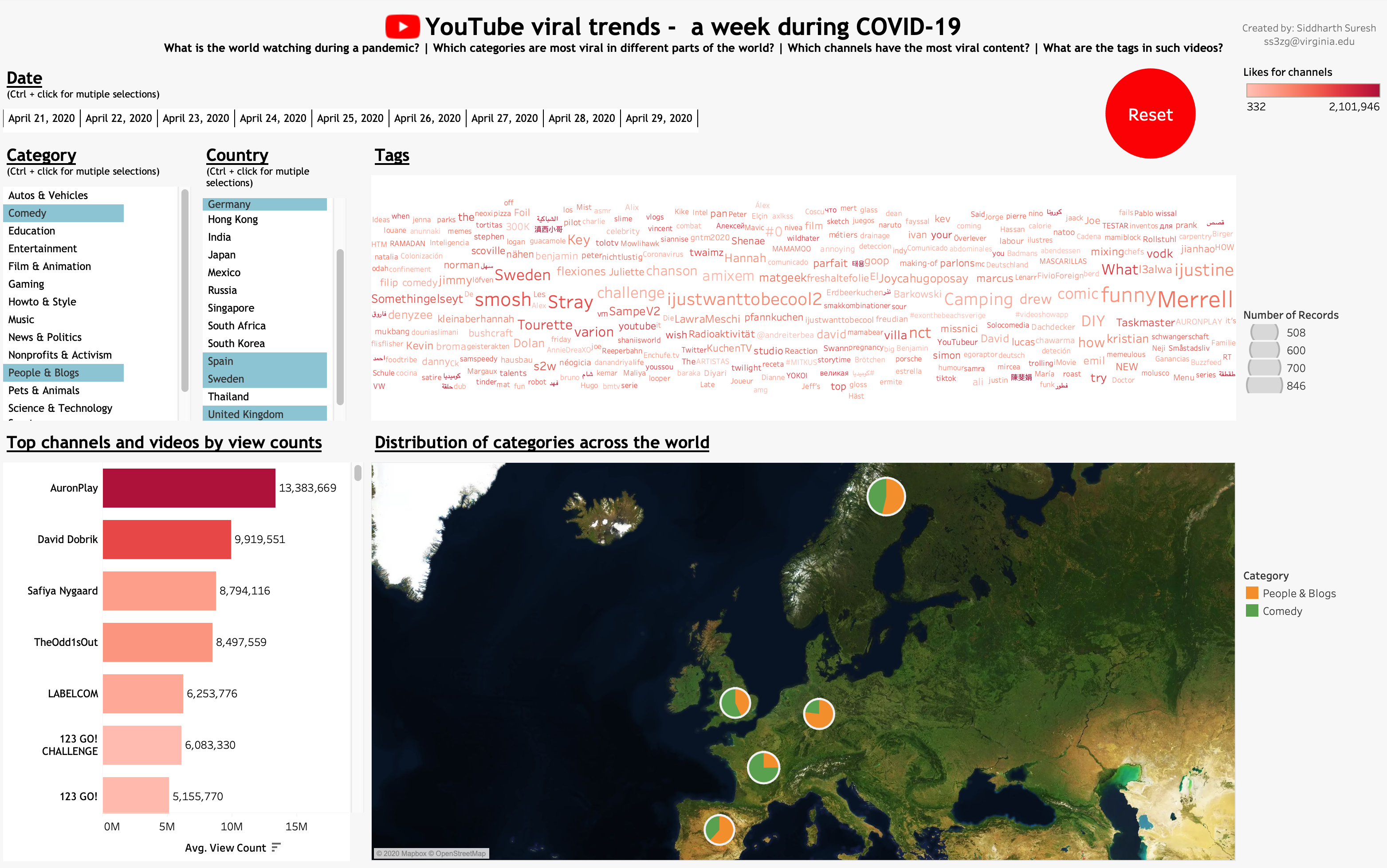
While UK and France seem to watch more comedy videos, Spain, Sweden and Germany seem to incline towards the people & blogs related videos. Furthermore, Merrell seems to stand out which is apparently a comedy channel.
-
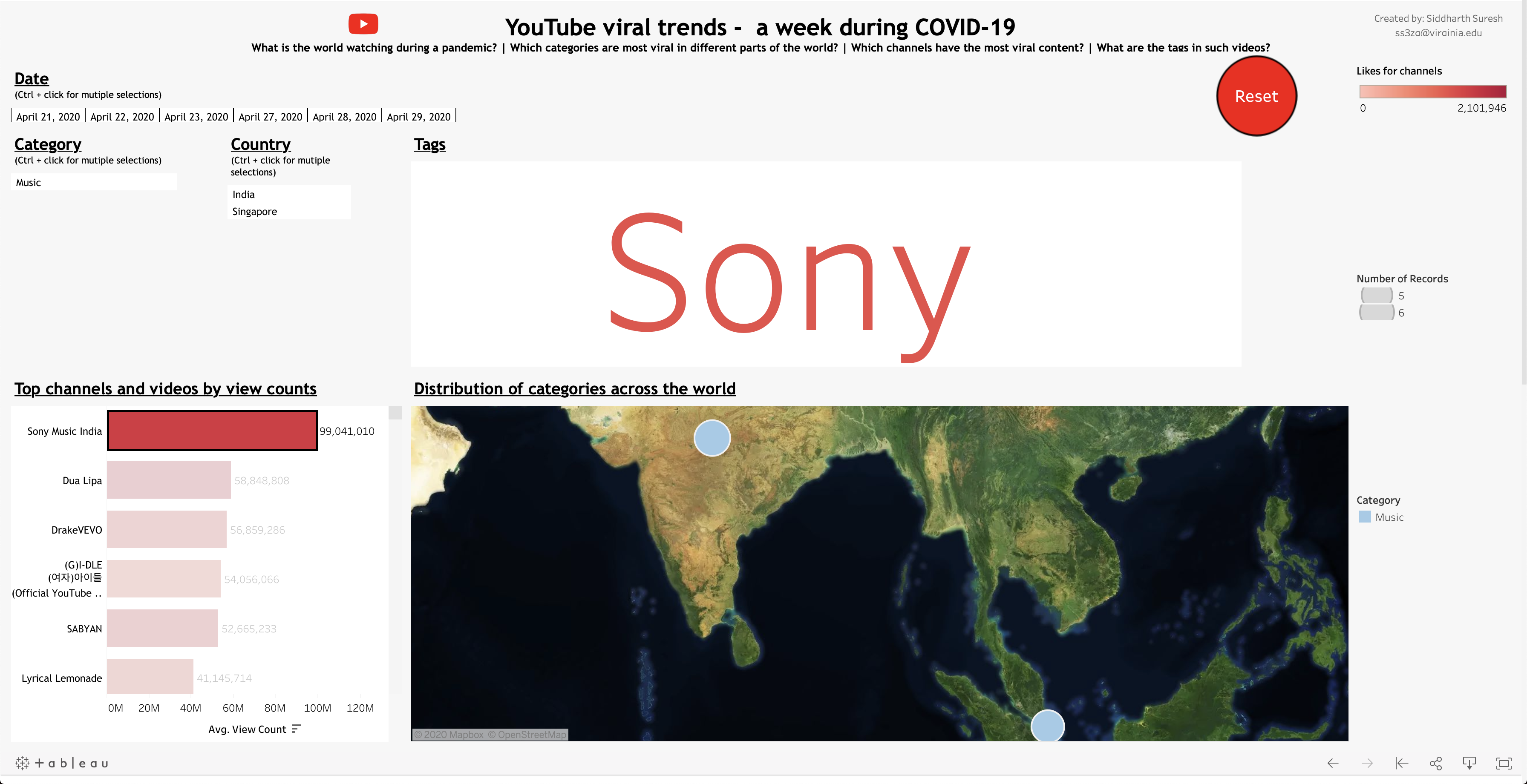
The most viewed channel ‘Sony Music’ is only watched in India and Singapore
-
The channel with the most likes ‘AuronPlay’ is only watched in Spain
-
In the sports category, the most viewed channels include ‘Dude Perfect’, ‘Sports HD’, ‘WWE’ and is mostly viewed in the European region, Australia and North America. Asia specifically has very low consumption relative to the rest of the world during COVID-19.
To explore this visualization yourself visit this link